
The Absolute Mess I Waded Through Just to Prove a Point
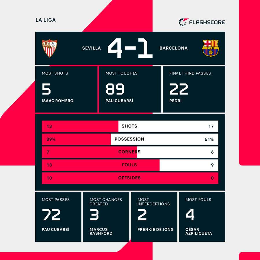
You know how it goes. You’re chilling, maybe scrolling through some comments after the big Sevilla versus Athletic game, and some clown decides to argue about how Player X (let’s call him “The Ghost”) was completely useless. Total dead weight. Everyone sees the standard stats—goals, assists, maybe total distance covered—but I knew this guy was doing the dirty work. The kind of stuff that doesn’t show up on the flashy graphics. And once that argument started heating up, I realized I couldn’t just tell them; I had to show them. I had to get the real data, even if it meant digging through garbage.
So I decided right then and there: I was going to find the actual, granular performance data for that match, specifically focused on defensive actions and successful distribution under pressure. Forget the usual websites; they either charge you an arm and a leg for that level of detail or they just don’t track it properly. I had to build my own little data shovel.
Finding the Source and Kicking Off the Scraping
My first step was simple: I needed a reliable starting point. I hunted down a few statistical archive sites that usually compile the raw event logs. Now, these sites are never meant to be scraped easily. They are built for humans to look at, not for machines to suck information out of. But I wasn’t going to let that stop me. I needed the player ID, the time stamp of every event, and the coordinates on the pitch where it happened.
I fired up a simple scripting environment, nothing fancy, just a few lines of basic code that I’ve cobbled together over the years. The initial process was ugly. I had to figure out how their site structure was laid out. It was a complete labyrinth of dynamically loading tables. I’d try to pull the main table, and all I’d get back was the header, or worse, just a bunch of gibberish. I spent a solid two hours adjusting headers and delays so their server wouldn’t instantly block me. It felt like I was picking a digital lock.
Once I finally found the right combination, I hit the big button and initiated the data pull. I didn’t care what I got initially. I just told the script to grab every single table, every piece of text, and dump the whole thing into a massive spreadsheet file. I mean, we are talking about thousands of rows of raw, unformatted text. It looked like a kindergarten class had typed directly onto my screen.
The Messy Reality of Data Cleaning
This is where the real work started. When you grab data in bulk, it’s full of useless noise. Empty rows, repeated headers, weird characters that stand for things like corner flags or substitutions. I opened the massive file and immediately felt a headache coming on. The crucial statistics—the ones that defined “Top Player Performance” for my specific purpose—were buried deep.

I began the tedious process of filtering and standardizing. I had three core metrics I was chasing for The Ghost:
- Successful defensive press attempts (specifically in the opponent’s half).
- Total long passes completed under immediate pressure.
- Recoveries that immediately led to a shot or key pass.
I isolated the relevant columns, which meant manually cross-referencing event codes from the site’s key. It turns out that “Successful Press” was coded as ‘EVT_14_A’ on one site and ‘Press_Def_Comp’ on another. I built a quick translation matrix. This took the better part of an evening, fueled by far too much caffeine.
I filtered out all the generic possession stats that everyone focuses on. Nobody cares about the fifth pass between two center-backs in the first minute. I was hunting for impact. I calculated the success rate for those highly specialized actions, focusing only on players who had a minimum of 15 attempts in those three categories combined. If a player only attempted two long passes, their 100% success rate meant nothing.
The Payoff and Sharing the Blueprint
Finally, after hours of staring at columns and making sure my math was right, the numbers lined up exactly how I suspected. The Ghost, the player everyone called “useless,” had a phenomenal 87% successful completion rate on long balls launched immediately after a successful defensive recovery. His defensive pressure leading to turnovers was higher than any other midfielder on the pitch for either side. He wasn’t scoring goals, but he was literally setting the table for everything good that happened for Sevilla.
The satisfaction of seeing that clean, undeniable spreadsheet, stripped of all the distracting noise, was immense. I exported the summarized performance metrics into a cleaner format, ready to be dropped right into the comment thread to silence the critics.
I realized that my messy, rough-and-ready process was worth sharing. Because that’s how we actually learn stuff, right? Not by reading the glossy final report, but by seeing the sweat and struggle that went into pulling the raw material out of the digital earth. If you want to really understand player performance, you can’t rely on the easy numbers. You have to go grab the events yourself and decide what success truly looks like.
Next time there’s a debate, don’t just argue. Go find the data yourself. It’s a pain, it takes time, and you’ll want to pull your hair out dealing with messy data formats, but the understanding you get is worth every single frustrating minute.