
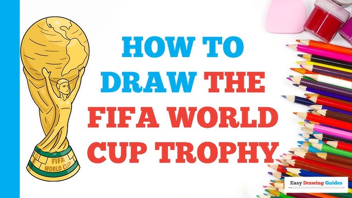
The Shameful Attempts and the Discovery
Man, let me tell you, I tried to draw that World Cup trophy maybe four times last month. Total disaster. Every single time, it ended up looking like some weird, lopsided vase that had been left out in the sun too long and was starting to melt. I’m not saying I’m Da Vinci, but seriously, how hard can two people holding up the world be? Apparently, unbelievably hard for my brain to process.

The problem was always the symmetry. I’d nail one side of the handles, and the other side would look like a banana. The base wasn’t a nice smooth stack; it looked like a stack of pancakes that fell over. I’d start getting really stressed out about how to make those little human figures look right, and then I’d just ball up the paper and chuck it across the room. It was turning into a total headache, and honestly, I was ready to just give up on ever drawing anything remotely cool.
My old man, he’s kind of a stubborn guy, and he always used to tell me, “If the complicated way doesn’t work, you’re doing it wrong. Find the cheat sheet.”
So, I ditched the fancy art-school tutorials that made me feel stupid. I stopped worrying about perfect ellipses and perspective. I went hunting for something truly basic—something that a five-year-old could follow if they had a cheap ruler. What I stumbled across wasn’t a drawing lesson; it was a simple geometry hack, and honestly, that simple trick totally changed the whole game for me.
I realized the whole time I was thinking about the trophy when I should have been thinking about a stack of shapes. Trust me on this, it’s not about being an artist; it’s about being a slightly better-than-average user of a pencil and a straight edge.
The Gear and the Game Plan
First things first, I grabbed my gear. No need for anything expensive, seriously. I pulled out just what I had lying around:
- A cheap pencil: Nothing fancy, just a regular HB pencil I found in a kitchen drawer.
- A crummy eraser: The kind that leaves smudges, because I knew I’d mess up a lot.
- A piece of printer paper: Just regular A4.
- An old plastic ruler: The most important piece of the puzzle.
The game plan was simple: Start with the absolute center, build the structure using boxes, and only then try to make it look smooth. I had to drill into my head: The ruler is your best friend.
Building the Trophy with Boxes: My Step-by-Step Execution
This is exactly how I executed it, step by simple step. I started at the top and worked my way down, which felt counter-intuitive, but it worked to keep the height right.
- The Center Line: I took the ruler and drew one long, faint, perfectly vertical line right down the middle of the paper. This line is the anchor. Everything has to be mirrored perfectly across it. If you only do one thing right, make it this line. I spent a good five minutes just making sure it was straight.
- The Base Rectangle: Way down at the bottom, I drew a short, wide, rectangular box. It didn’t need to be perfect, just a clear, solid block. This is what the trophy sits on. I then drew a slight curve on top to make it look a bit less blocky.
- The Main Body: Above the base, I extended two lines upward, keeping them close to the center line. This created a much taller, skinnier rectangle, but I made sure it flared out slightly toward the top. I kept looking back at the real trophy picture to see how it curves—it’s not a perfect cylinder, it’s a flared cup shape. I used my pencil lightly to sketch the rounded sides of this flared cup, erasing the original harsh rectangle lines as I went.
- The Figures/Handles: This was the part that always messed me up, but the hack fixed it. I realized the figures are just two big, elongated ‘S’ curves. I started an ‘S’ shape on the left, curving in near the center line and then flaring out toward the top. I immediately did the exact opposite ‘S’ on the right. This gave me the basic shape of the two abstract human forms lifting the world. They looked simple, almost like ribbon, but they worked. I didn’t try to draw fingers or faces, just the shape.
- The Globe on Top: Right at the very apex of the ‘S’ curves, I used a small circular object (it was actually the bottom of my coffee mug) to lightly trace a perfect circle. That’s the globe. No freehand wobble this time. Cheated? Maybe. Effective? Absolutely.
- Adding the Details: I drew the basic continental shapes very, very lightly onto the globe. I added the two tiny rings onto the base. Then, the most satisfying part: I took a slightly darker pencil and started outlining the keeper lines, the ones I knew I wanted to stay.
- Shading It Out: I wasn’t going for photorealism, just depth. I picked a side—the left—and decided that would be the dark side. I quickly shaded the base, the underside of the handles, and the left side of the cup body. I didn’t blend it perfectly, I just made it look like a drawing.
The Final Verdict and the Lesson Learned
When I stepped back from it, I was kind of shocked. It wasn’t museum quality, sure. My shading was still a little messy, and one of the ‘S’ curves was probably wider than the other. But you know what? It looked like the trophy. For the first time, it didn’t look like a melting vase or a fallen pancake stack; it looked like the actual, iconic piece of shiny gold that everyone watches on TV.
The lesson here is simple, and it’s what I want to pass on: Whenever you’re struggling with something that feels too complicated—whether it’s a drawing, coding, or fixing a dodgy shelf—stop trying to be the expert. Stop trying to do the complex method. Go find the absolute dumbest, simplest geometric or structural trick you can, and just execute that. It takes the pressure off. This guide is super easy because you’re not drawing a trophy; you’re just drawing a bunch of squares and ‘S’ shapes, and anyone can manage that. Now I just need to figure out how to draw a football that doesn’t look like a deflated balloon.