Man, you look at those World Cup mascots every four years and half the time you think, “Seriously? That’s what millions of dollars bought?” They either look like they escaped from a budget children’s cartoon or they’re so aggressively abstract you can’t even tell what they are supposed to be.

I got really obsessed after the last Cup, you know, the one with that weird purple blob thing. I thought, I bet I could figure out how they actually do this. Not just draw one, but figure out how FIFA runs the whole show—the constraints, the committees, the absolute mess of it all. So I decided to treat it like a serious practice project and reverse-engineer the creative process.
The Messy Start: Hunting Ghosts
First thing I did was try to find some official design brief or competition guidelines. If you think that stuff is public, you’re dreaming. It’s locked down tighter than the schedule for the final match. You won’t find the rules for mascot design posted anywhere on the official site. So, I had to become a detective.
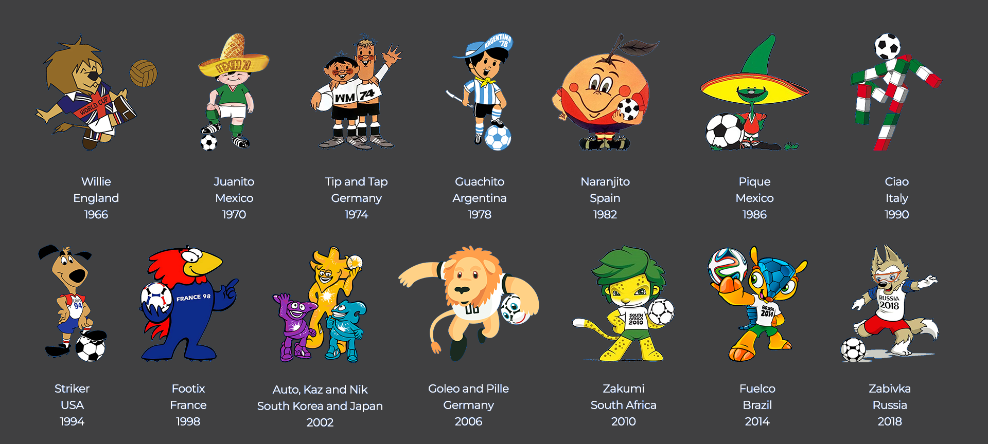
I started pulling up every single mascot since 1966—starting with Willie the Lion, who honestly looked like he’d been dragged through a hedge backward, but he was charming. Then I moved through the decades. Wow, those early ones were rough. The German ’74 guys, Tip and Tap, were just two dudes in kits. Simple, dumb, effective. Then came the era of aggressively cute animals and, more recently, the era of “what the heck is that?” abstract concepts.
I spent maybe a week just documenting common features. I literally put them all in a spreadsheet and tracked things like: Is it an animal? Is it human? Does it have exaggerated sports gear? How many colors does it use? How many limbs? I know, totally nerdy, but I was committed to cracking this code.
Establishing Constraints: The Three Rules of Blandness
After staring at decades of fluffy creatures and geometric shapes, I realized the professional process isn’t about artistic freedom; it’s about avoiding disaster. I figured out there are three absolute, non-negotiable rules they must follow, even if they never write them down in a brief. These became the boundaries for my own mock design.

- Rule 1: Thou Shalt Not Offend. This is massive. When you are dealing with fifty different cultures watching, even a slightly off-color choice of blue or the shape of an ear can start an international incident. The mascot has to be culturally specific enough to nod to the host nation, but so generic it can’t possibly insult anyone in a secondary market. That’s a tightrope walk that usually results in something boring.
- Rule 2: It Must Be Fully Flexible. This isn’t just about animation. It has to look good as a CGI character, as a giant sweaty costume dancing in 110-degree heat, and as a low-res print on a $2 plastic cup. If it has too many fiddly details—complex patterns, tiny shoes, weird accessories—it immediately fails the merchandising test. That’s why so many of them are simplified, robust forms.
- Rule 3: It Must Whisper ‘Global Commerce’. This is the hardest design challenge. It needs local flavor—maybe a specific historical hat or an indigenous animal—but its primary job is to sell millions of plush toys everywhere from Jakarta to Johannesburg. It needs to look like a friendly character that kids want to hug, regardless of the cultural reference.
My Practice Run: Failing Immediately
Okay, so armed with these self-imposed rules, I grabbed my sketchbook and decided to try designing one for a hypothetical South American host country that was maybe a bit obscure, just to challenge the cultural requirement. I picked Chile.
My first few sketches were based on the Andean condor. Majestic, right? Wrong. Too aggressive. The beak looked threatening. Scrapped it. Then I tried some sort of stylized, anthropomorphic representation of the Atacama Desert flora. It looked like a confused cactus in a football shirt. Scrapped that too.
I spent days trying to marry the vibrant culture with the simplified geometric shape needed for mass production. Every time I nailed the look, I failed the “no offense” rule. Every time I made it bland enough, it lost all the cool Chilean flair. It was agonizing. I was stuck between making something authentic and something commercially viable.
The Realization: It’s Not Art, It’s Bureaucracy
After about a month of this frustrating back-and-forth, I realized the actual design process for FIFA doesn’t start with a designer sketching cool ideas. It starts with a huge marketing brief, political positioning, and a pile of bureaucratic forms.
I dug into some articles about the selection process for the 2014 Brazilian mascot. It’s a total mess of submissions. They don’t just hire one designer; dozens of top-tier agencies pitch ideas—usually 50 to 100 concepts are floated internally. And those concepts are meticulously vetted by committees. Committees full of FIFA officials, host country political delegates, and branding experts who probably haven’t drawn anything since kindergarten.

The design team, the ones who actually make the final image, if they’re lucky, get to spend maybe four months refining the final three choices. But those choices are often already constrained by market research data that cost millions of dollars. They already know the rough shape, color palette, and demographic profile of the mascot before the artist even puts pen to paper. It’s all reverse-engineered from sales projections.
I remember showing my final, polished concept—a simplified, fire-red Chilean fox shape that met all the geometric requirements—to a friend who works in corporate branding for a huge retailer. He didn’t even look at the drawing.
“Does it have an easy-to-trademark name?” he asked immediately. “And does the costume actor have to be really flexible to do the required dance moves on stage for eight hours a day?”
I just stared at him. I had spent all my time worrying about cultural synergy and dynamic lines, and he was worried about intellectual property protection and the poor intern sweating inside the foam suit. That’s when it clicked. They don’t design mascots; they engineer walking, talking, highly political merchandise licenses that need to appeal to everyone and offend no one.
My practice run taught me that if you want to design a World Cup mascot, you shouldn’t be sharpening your pencil; you should be studying the quarterly sales reports of the top global toy manufacturers. It’s a job for a committee, not an artist.

