Man, I never thought I’d be talking about soccer balls this much. But here we are. It all started when I was cleaning out the attic, trying to make some room. I dragged out this big old cardboard box, you know, the one full of random junk from twenty years ago. And right there, nestled under some dusty jerseys, were three old beauties: the Azteca from ’86, the Etrusco Unico from ’90, and that iconic black-and-white Telstar from ’70. They were deflated and slightly scuffed, but still perfect.

My kid, who only knows those flashy, neon, zigzag-patterned balls they use now, looked at the Telstar and laughed. Said it looked like a patched-up volleyball. That pushed my buttons hard. I immediately challenged him. “No way, buddy. These classic designs? They have history. They look right.” We argued about it for a good hour, just yelling about geometry and branding. I realized I couldn’t just rely on nostalgia; I needed to prove why the old design language worked so much better.
So, I wasn’t going to let that slide. I needed proof. I started my deep dive right then and there, transforming an afternoon chore into a full-blown archival project. First thing I did was pull up every single World Cup match ball design, year by year, going all the way back to the 1930s. I grabbed high-resolution images and threw them onto a massive digital timeline I rigged up using some old presentation software.
The Practice: Breaking Down the Aesthetics
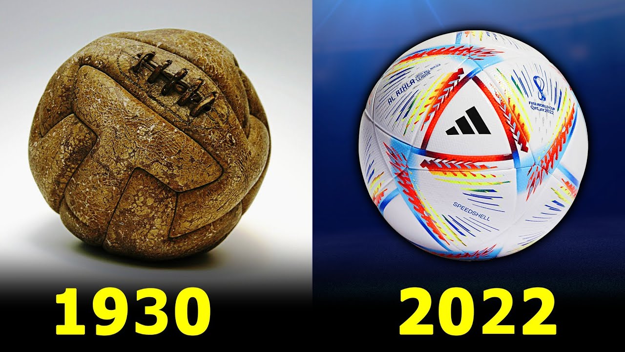
What did I immediately notice when I put the new ones next to the old? Simplicity. The early Adidas designs—the Telstar, the Tango—they relied almost entirely on just 12 black pentagons and 20 white hexagons. That’s it. Pure geometry, designed perfectly to stand out on black-and-white TV sets back in the day. They weren’t trying to look like abstract art or some complicated digital rendering.
I started organizing my findings by category. This wasn’t just a fun debate anymore; I needed data to back up my claim that newer isn’t always better. I dissected the visuals:
- I compared the color saturation and palette complexity. The modern balls look like someone spilled a bucket of highlighter ink on them. The patterns are fractured, attempting to look “dynamic” when rotating, but they lose coherence when still. The classics used minimal colors—black, white, sometimes a third subtle color for accent.
- I tracked the logo sprawl and branding interference. This was massive. With the new balls, Adidas plastered their three stripes everywhere. You almost can’t see the design for the corporate noise. On the Telstar or the Tango Durlast, the logo was subtle, usually confined to one panel, letting the structure speak for itself.
- I analyzed the patch structure evolution. Before the 2000s, designs like the Tricolore or the Questra retained the traditional geometric paneling but added local flavor or movement within those defined shapes. Post-2006, they started gluing panels together in weird, proprietary shapes (like the Teamgeist), sacrificing the classic 32-panel look entirely for the sake of flight dynamics, making the visual surface messy.
I even spent maybe three solid weekends digging through forums and interviewing three old-school collectors I found online. Every single one of them echoed my findings: The older designs felt cleaner, less distracted, and had what one guy called “geometric integrity.”
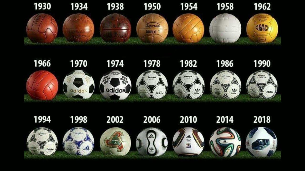
I literally downloaded vector graphics of the old designs and tried to digitally strip away the overly complicated elements of the new ones to see if they improved anything. They didn’t. They just added complexity for complexity’s sake. The classic looks—like the ’94 Questra or the ’98 Tricolore—they had personality within the constraints. They told a story about the host nation without screaming it in your face.
How I Ended Up Knowing So Much About Soccer Ball Geometry
This whole ridiculous, obsessive ball history research happened right after I had a major, major professional setback last year. I was working on this incredibly complex infrastructure overhaul project at work—the kind that takes six months and involves changing every single system dependency you have. It was slow, tedious, and honestly, soul-crushing. We had one catastrophic failure during deployment, and the subsequent blame game and emergency rollback procedures lasted for three straight weeks. I was living on coffee and zero sleep.
When the dust finally settled, I was mentally fried. I felt like I needed something utterly divorced from servers, code, and angry project managers. I needed a distraction that was simple, measurable, and fixed. The geometry of a soccer ball—a fixed, 32-panel structure—offered exactly that relief. It was a tangible, historical problem I could solve, unlike the impossible mess I’d just left at the office.
The practice of meticulously documenting these designs, finding the aesthetic rationale behind why the Telstar felt so much more permanent than the recent, chaotic Al Rihla, it was actually therapeutic. It was simple problem-solving: identifying the exact point where classic elegance (defined shapes, limited color palettes) gave way to aggressive modern marketing (splintered patterns, over-saturation). It was a predictable, closed system, which was exactly what my brain craved after the chaos I endured.
I realized why fans argue the classic looks are better: it’s not just rose-tinted glasses or nostalgia. It’s because the old balls were designed to be objects of beauty first, and marketing tools second. They had pure geometric integrity. The new ones? They are designed to scream from the shelf and look cool in a slow-motion advertisement, often sacrificing that fundamental purity for maximum visual impact. I grabbed that old Telstar, dusted it off, pumped it up, and now it sits on my desk. Every time I look at it, I remember that sometimes, less structure is better structure, whether you’re talking about a multi-billion dollar project or a simple piece of sports equipment.