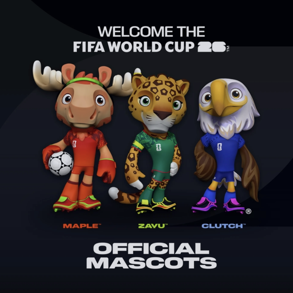
Man, I never thought I’d be spending a whole weekend digging through dusty football history just to rank some foam characters, but here we are. This whole thing started because I got into a massive, dumb argument with my neighbor, Tony, about the 1974 World Cup. He claimed it was the most boring tournament ever. I told him he was crazy. We started arguing about the atmosphere, the kits, and somehow we landed on the mascots. Tony couldn’t even name the ’74 mascots. I realized I was struggling too. I could rattle off Zakumi (South Africa, 2010) and maybe that weird alien thing from France ’98, but the rest? Total blanks.

I hate losing a bet, even a small, stupid one about cartoon lions. So I told him I’d find every single mascot and we’d rank them properly. That’s what kicked off this whole project. It was supposed to be a quick list on a napkin. It turned into a full-blown archival investigation.
The Grind: Digging Up the Forgotten Foam
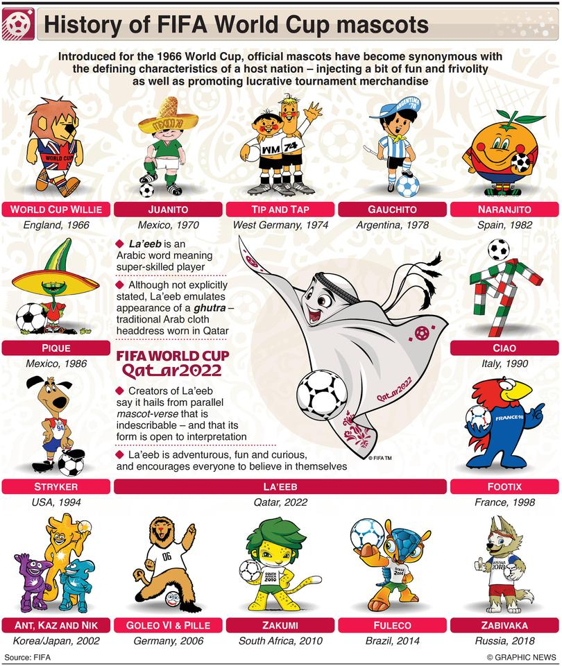
The first step was just listing them. I opened up a clean spreadsheet. I started typing what I remembered. 1966, Willie, the Lion. Easy. Then I hit ’70 and ’74. This is where the headache began. Trying to find official, high-resolution images of Juanito (Mexico ’70) and Tip and Tap (West Germany ’74) was rough. Most sites had tiny, blurry thumbnails. I had to cross-reference three or four different archival blogs and forums just to confirm the colors were right.
I initially thought the list started in 1966. Wrong. Turns out, the history is a little fuzzier. Some tournaments had unofficial characters. I decided to stick strictly to the officially recognized, named mascots starting with Willie. If I included every regional attempt, I’d be here until the next World Cup.
My workflow looked something like this:
- I scraped all the years from 1966 to 2022.
- For each year, I identified the mascot’s name and species/type.
- I tracked down three distinct visual references (photos, official artwork, or merchandise shots) to confirm accuracy.
- Then I jotted down a quick note on the design theme and its connection to the host nation.
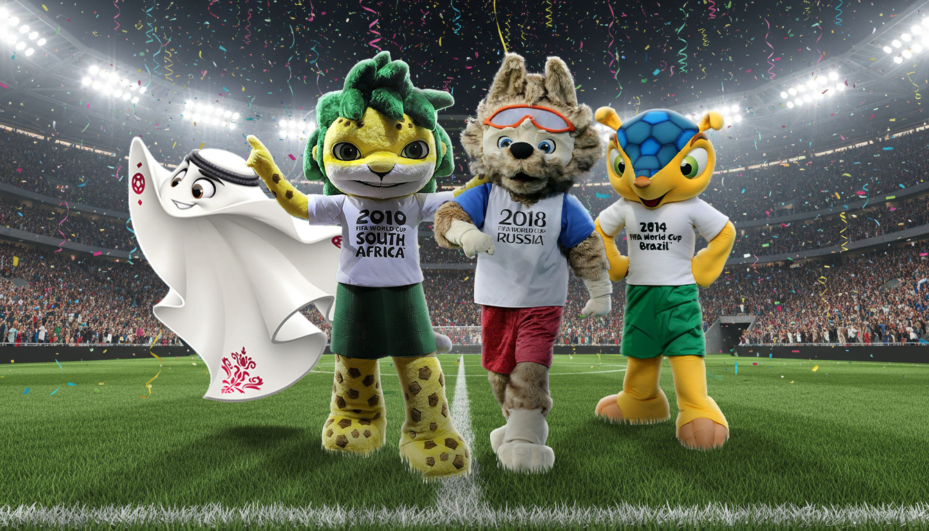
That last part was the real eye-opener. I realized how little effort went into some of them. Tip and Tap are just two boys in football shirts. Nothing special. Then you get the absolutely bonkers ones, like Footix (France ’98), which is a giant blue rooster—okay, French symbol, that works—but looks like he was designed on a cheap computer in five minutes. Contrast that with Fuleco (Brazil 2014), the armadillo, which actually felt unique and tied to the ecosystem. I spent a good hour just staring at them and debating their merits.
Setting the Rules for the Vote
Once I had the full list of 15 official mascots, I had to figure out how to judge them. This couldn’t just be about “cuteness.” That’s too subjective. I developed three key criteria. These are what you guys should use when you cast your vote:
1. Cultural Relevance (The Story): Does it actually make sense for the host country? Did they just slap a soccer ball on a generic animal, or does it genuinely represent a local tradition, animal, or history? Example: Pique (Mexico ’86). It’s a jalapeño pepper with a sombrero and a mustache. Stereotypical? Maybe. Memorable? Absolutely. Culturally relevant? You bet.
2. Design Longevity (The Look): Does it hold up? Some of the early 3D renders look absolutely terrifying now (The Spheriks from 2002, I’m looking at you—those things look like they are here to steal your soul). The design should be clean, iconic, and easily recognizable.
3. Merch Potential (The Hype): Would you actually buy a stuffed version of this thing? Is it fun? Is it mascot-y? Willie the Lion just looks like he’s having a great time. Others look stiff and awkward.
I finished compiling the list and spent another hour finding the best available images. It’s ridiculous the work I put into this just to prove Tony wrong. I arranged them chronologically first, then I put together my own internal Top 3 list just to see if it matched what I thought the popular opinion would be. Turns out, my personal favorite is Zabivaka (Russia 2018)—that wolf just has style.
The Final Tally and Your Task
The whole exercise took about six hours of focused attention, spread across Saturday afternoon and Sunday morning. It felt like I was back in university doing a presentation, not just messing around with historical cartoon characters.
I uploaded the entire roster of candidates. I checked all the names twice to make sure I hadn’t mixed up the two leopard brothers from ’74 (I’m kidding, there were no leopard brothers, but sometimes the research felt that dense).
Now the ball is in your court. I presented the field, I established the judging criteria, and now I need you guys to weigh in. Don’t just vote for the one you remember from the last tournament. Seriously look back at the history. Consider the weirdness of the 1970s and 80s designs. Think about how much effort was (or wasn’t) put into representing the host nation.
Go through the list. Pick out the coolest one. And when you decide, drop a comment explaining why! Was it the design? The vibe? Was it the tournament they represented? Let’s see if we can finally settle this completely pointless but utterly essential debate.
I’ll share the results later this week and we’ll see if the community agrees with my assertion that the 2002 Spheriks are actually a crime against humanity.