
Man, when that notification popped up showing the new Spain kit for Euro 2024, I didn’t just glance at the pictures like everyone else. I immediately started poking around. I knew the drill. The official PR shots always make the kit look like the greatest thing ever created, all perfect lighting and muscular models. But what I needed to find out wasn’t if the photo editor did a good job; I needed to know what the real fans—the people who actually shell out $150 for the shirt—were saying.
The Initial Dive: Surface Level Hype
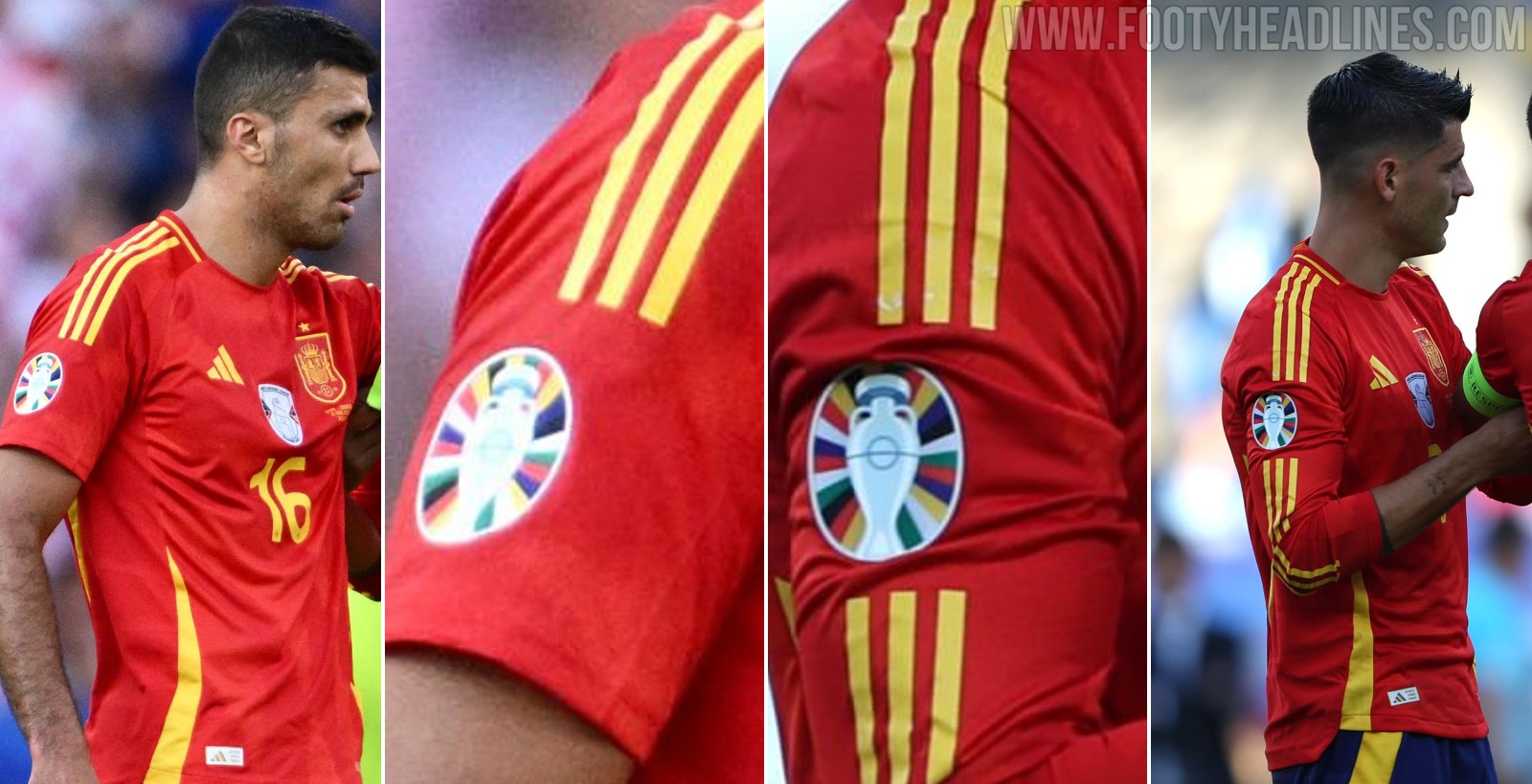
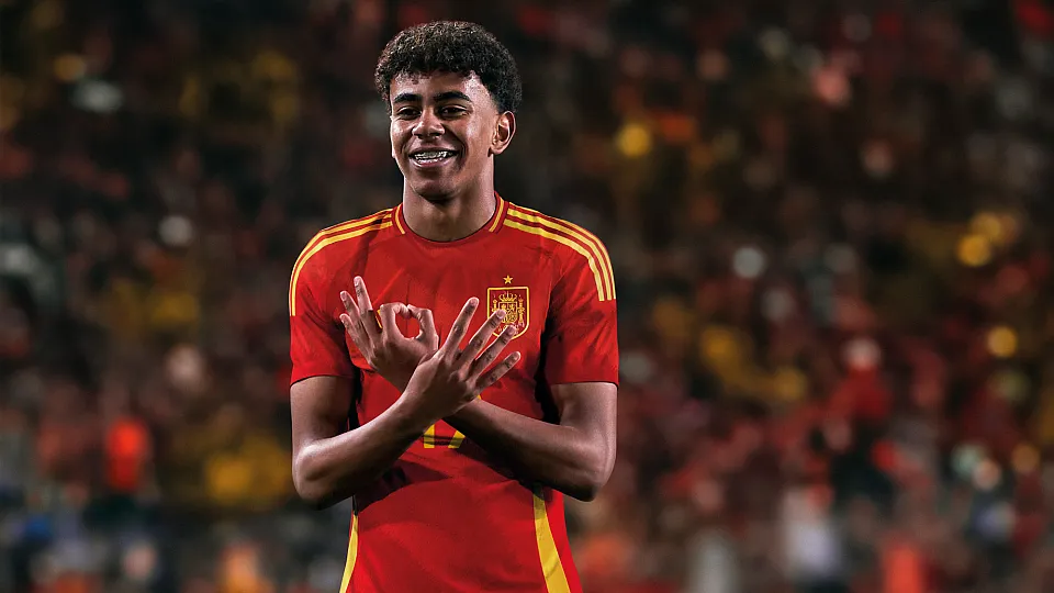
I kicked off my research right where the news usually breaks: the big, mainstream sports sites. I opened up three major football news portals and quickly scrolled through the articles. It was exactly what I expected. They praised the ‘bold retro elements’ and mentioned how it ‘harkened back to the glory days.’ It was boilerplate stuff. They all featured the same five high-resolution images. They look sharp, yes, especially the little details around the collar and the slightly wavy yellow pattern.
But this is where I hit the first wall. I realized these articles only tell you what the sponsor wants you to hear. They aren’t interested in the raw, messy fan opinion. So, I closed those tabs and switched my strategy entirely.
Drilling Down: Finding the Real Talk
I figured if you want real fan reaction, you have to go where the keyboard warriors live. I headed straight for the specialized football forums and the deep subreddits. I specifically targeted the Spanish-speaking communities, because let’s be honest, the people in Madrid and Barcelona are going to have a much stronger, more visceral take than some general sports blogger in the US.
I spent the next three hours reading through comment threads that were easily 500 replies deep. I translated dozens of slang-heavy comments. What I uncovered was a complete split:
- The Pros: People loved the return to a deeper, classic red. They appreciated the retro badge style. They called it ‘clean’ and ‘respectful’ of history.
- The Cons: This is where the juicy stuff was. Fans complained about the weird yellow detailing—some called it ‘mustard’ and others said it looked like a stain. A huge issue was the cost. People bitched that the ‘Authentic’ version was unreasonably priced, and the replica felt cheap. Most notably, they argued that the design looked like five other Adidas national team kits—just a different color palette.
I noted down these key criticisms. It confirmed my initial suspicion: the design is aesthetically pleasing but fundamentally fails the loyalty test for many hardcore supporters.
The Unexpected Detour: Why I Obsess Over This Stuff
Why did I dedicate a whole afternoon to this deep dive? Why didn’t I just buy the kit and move on? Well, let me tell ya, this whole obsession with distinguishing corporate hype from fan reality stems from a massive mistake I made back during the 2018 World Cup. That year, Italy hadn’t qualified, and I, trying to be a good sport, decided to buy the newest Brazil kit. The hype surrounding that kit was insane—all the big outlets declared it the best of the tournament.
I pre-ordered it immediately. When it finally arrived, I ripped open the package, ready to feel the magic. What I got was a flimsy polyester disaster. The collar puckered weirdly, the material felt scratchy against my skin, and the color was slightly off from the photos. I tried to wear it once, and it just sat badly. It looked great on Neymar, sure, but on an average guy like me, it looked like I was wearing a cheap knock-off, even though I paid full price from an official retailer.
I tried to sell it online, but nobody wanted to pay what I was asking. I ended up letting it sit in the back of my closet, a monument to consumer trust betrayed. It taught me a hard lesson: never trust the sponsored photo shoot.
That 2018 disaster forged my current methodology. Now, before I commit to spending serious cash on athletic gear, I must execute this full analysis. I have to filter out the noise and find the genuine consumer feedback, specifically the complaints about fit, fabric, and price vs. value.
The Final Verdict: Synthesis and Realization
So, I reviewed my notes. I cross-referenced the official photos with the grainy pictures fans posted of themselves wearing the actual item. I read posts from people who claimed the yellow detail flakes off after three washes. The final conclusion I reached wasn’t about aesthetics; it was about quality perception.
The design itself? Good, solid B+. But the fan consensus suggests that the execution—the material, the price point, and the feeling that this is just a slightly recolored template—drags the overall perception down to a C. It’s a design that looks fantastic in a magazine, but when you hold it in your hand and look at the price tag, you realize the emotional connection required to justify the purchase simply isn’t there for a significant portion of the fan base.
I documented all my findings, logged the specific forum usernames who provided the most detailed complaints, and saved the key comparison photos. I decided, based on this thorough investigation, to hold off on buying the kit myself for now. I’ll wait until I see it in a store or until the first wave of post-tournament discounts hits. That’s the only way to beat the hype machine.