
Man, I gotta tell you, I spent the last three days falling down a total rabbit hole. I just wanted to see what the ‘best’ World Cup poster was, you know? Just a quick look. It turned into this massive project where I dug through every single one, from the first one in 1930 all the way up to the latest one, which, frankly, is kinda forgettable. It wasn’t a quick search-and-check job; I turned it into a full-scale historical dive, and what I found completely changed my mind about what a poster is even supposed to do.

The Great Poster Dump and How I Sorted the Mess
First thing I did was a big search. I opened maybe twenty different “Top 10” lists across a bunch of design blogs and sports sites. I dumped everything into one massive folder—hundreds of images ranging from grainy photos of old prints to high-res modern digital art. Total chaos. It was a proper mess.
I realized right away that most lists online are garbage. They just pick the pretty ones or the ones with fancy typography. I decided my criteria had to be different. It wasn’t about the art; it was about the feeling and the impact. Did it actually represent the host country and the time the event happened? That’s what I was looking for. So, I developed this rough sorting system. I literally made three piles:
- Pile 1: The “Art School” Favorites (Pretty but Meaningless). These were the ones a designer would love. Good composition, cool colors. But if you took the text off, you wouldn’t know it was the World Cup. I tossed most of the recent ones in here.
- Pile 2: The “Just Football” (Action Shots and Players). Boring. They used photos of people kicking a ball or some generic stadium drawing. Low effort. They missed the point of capturing a moment in time.
- Pile 3: The “Iconic Storytellers” (The Keepers). These are the ones that, with one glance, shout out the time, the place, and the sheer historical context. These are the ones I focused on.
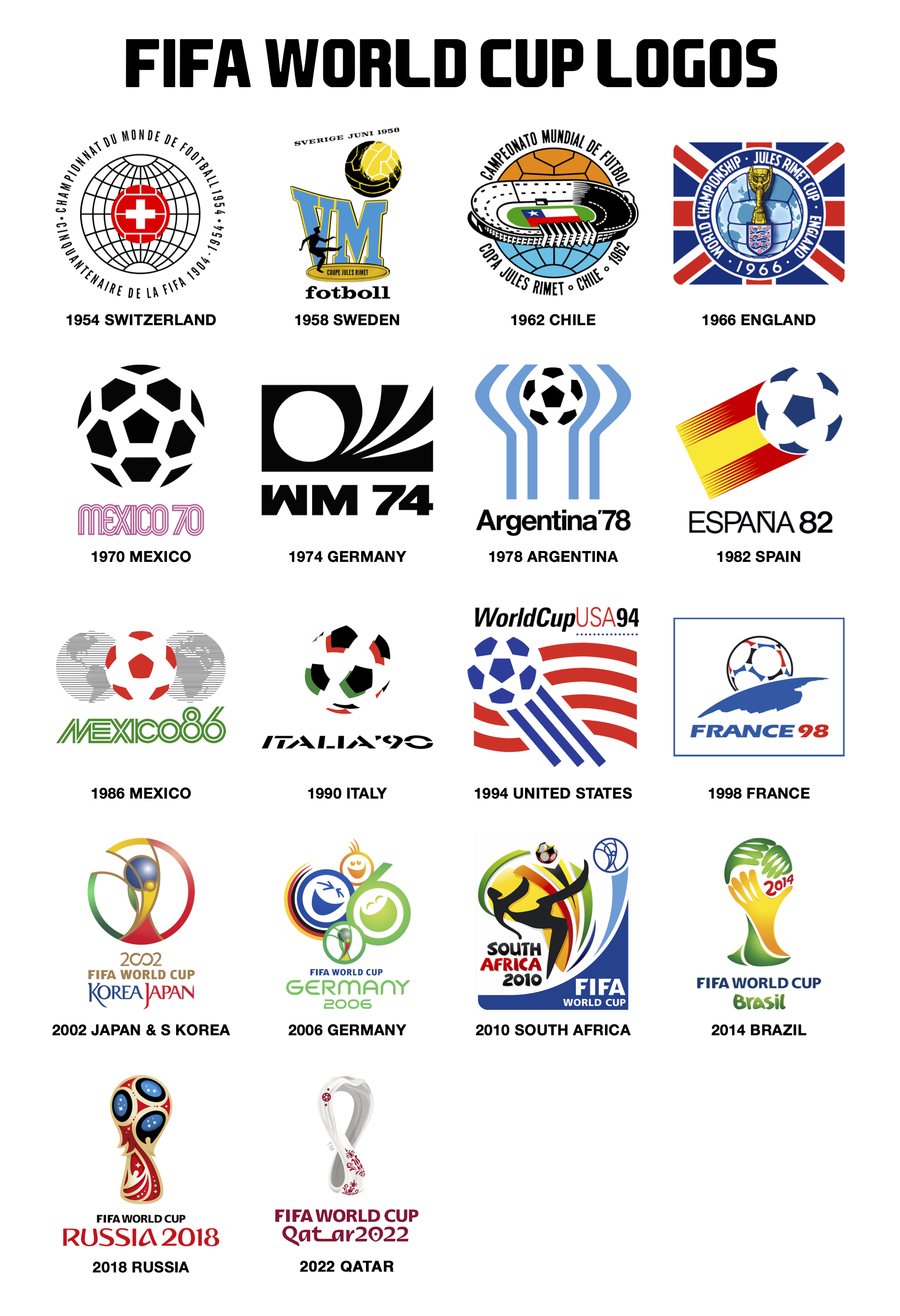
Then I started cutting. I got rid of everything before 1950 because the print quality and the scope just weren’t comparable. My real research kicked off when I focused on the posters that told a whole damn story—like the 1954 Switzerland one or the incredible graphic punch of 1970 Mexico.
Why I Even Bothered: It All Comes Down to ’94
You’re probably thinking, why did I even bother doing this? It sounds insane, right? Spending days on old posters? It all came down to the 1994 USA poster. The one with the kinda weird blue and red graphic look and the soccer ball trails. That was my first real, clear memory of the World Cup. I remember being maybe seven or eight years old, sitting in my grandpa’s dusty garage. They had this huge, ancient analog TV that barely worked, and they were trying to watch the tournament.
My dad, who was working some brutal retail manager job at the time, would sneak out every chance he got just to catch a game. I was supposed to be doing homework, but I was totally mesmerized by the chaos of this sport that barely existed in our corner of the US back then. That poster, with its loud, slightly clumsy American-style graphic design, was stuck on the wall of our local pizza place. Every time I looked at it, it smelled like pepperoni and hot summer asphalt.

Years later, my dad lost that job. Completely blindsided. I watched him struggle for months, taking whatever odd jobs he could find. We had to move houses, and I was forced to leave behind my whole childhood bedroom setup. He was stressed, the house was quiet, and frankly, we were barely getting by. Then, out of nowhere, he got a call that led to a job offer in manufacturing that he took immediately, a totally different path, just like that. That simple switch saved us.
I think about that time, that feeling of everything being up in the air, when I look at those early-to-mid 90s posters. They represent a raw, unpolished time of change. They don’t look perfect, but they feel real.
The Final Verdict: One Poster Rings True
After all that digging, sorting, and remembering, I finally landed on my top pick. It wasn’t the beautiful, sleek 1930s ones, and it sure wasn’t that weird 2002 one. My absolute favorite, the one that tells a story without even trying, is the 1966 England poster.
It’s simple. It has the three lions crest, a plain background, and a football in the middle. It’s almost boring, but it was released at a moment when Britain was still coming back up, dealing with the fallout from the war, and ready to host the world. It showed the country saying, “We’re here, we’re organized, and we’re ready.” It’s full of quiet confidence, not yelling, just knowing. And they won that one, too, which just locks in the history.
The 1966 poster shows up, gets the job done, and doesn’t apologize for its lack of flash. That’s the kind of quiet, steady execution I admire, both in design and in life. It feels like that stability my Dad found.
So, that’s it. That’s my big, messy journey through World Cup art history. Now I wanna hear from you guys. Which one actually means something to you?